
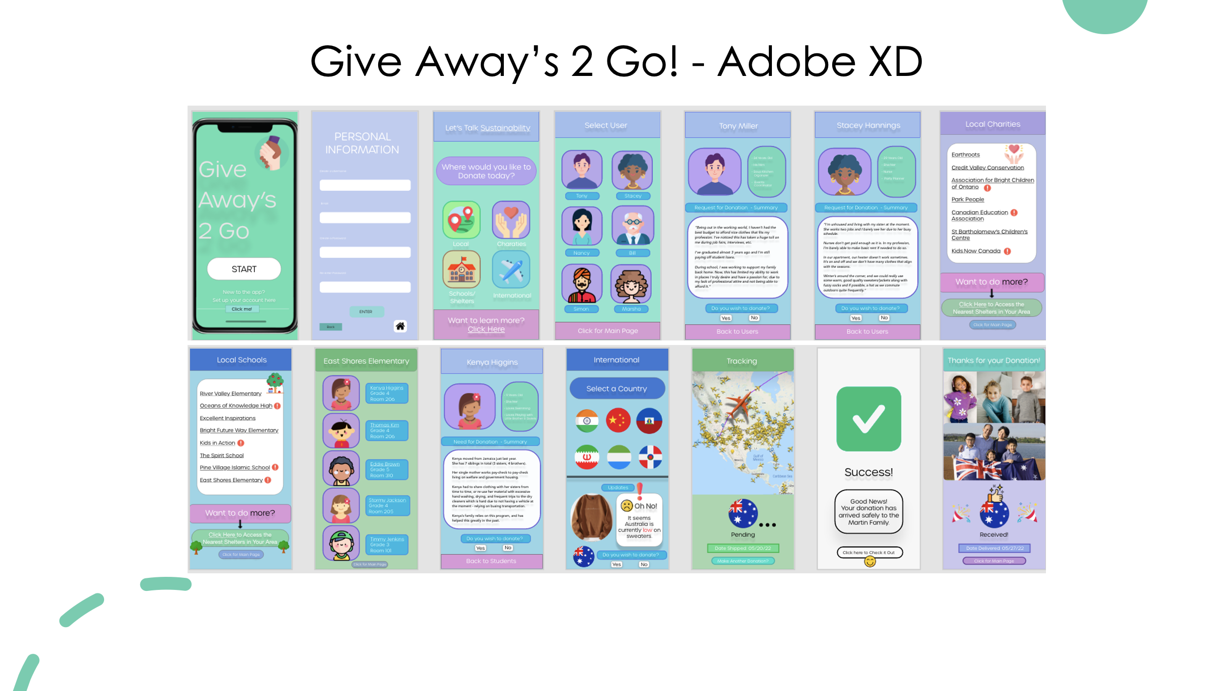
My application serves purpose to effectively limit clothing waste while providing donations to those who truly need it - highly benefitting the economy and giving users the chance to throw the junk away while helping your nearby neighbour one toss at a time.
🤲🏻 Give Away’s 2 Go!’ solely focuses on improving the lives of many especially those going through a difficult time.
👥 This applications displays users profiles and matches it with those local in their area. Users are able to read a description of the individuals in need for donations witnessing why they are a good fit for swapping.


📱 I have created a mobile swapping exchange service that will allow users to trade donations nearby to their local neighbour.
🌎 Users from all over are able to ship their clothing to place of their choice, track where it goes, interact with information, and be in full control of their property.
📝 Are able to manage tasks through a system of notifications and prompts.
😃 Users will strengthen their ability by playing a positive role in society to reduce Fast Fashion and Clothing Waste.
What is your Opportunity for Design Intervention and what are the Benefits Sought?
”My goal is to create change making a positive shift in the clothing and fashion industry. I want others to be informed on the psychology behind impulsive spending on clothes, why us as humans are wired to think we must have the LATEST thing/what’s trending, how the media has driven others to think and feel a certain way about fashion, etc.
The benefits sought from this research will prevent clothing waste, get others educated on topic, become inspired, etc.”
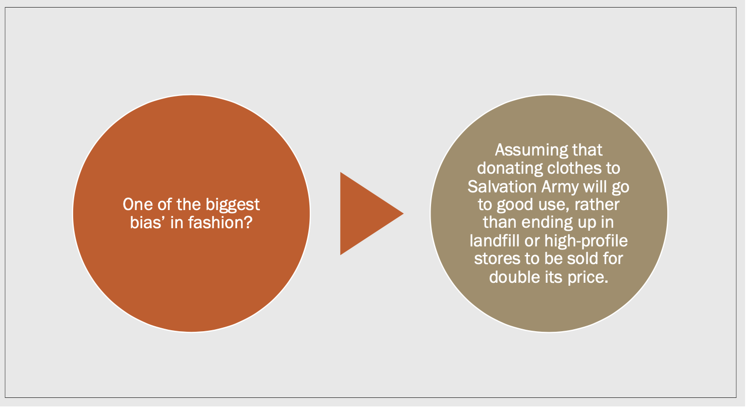
What were the Biggest Assumptions/Biases in your research? How did you Address Them?
"It’s level of difficulty, thinking it is non feasible to reach users worldwide, getting the word of issue, getting others educated and onboard.
Additionally, assuming that donating clothes to Salvation Army will go to good use, rather than ending up in landfill or high-profile stores to be sold for double its price.”


I rounded out 3 Potential Solutions That Can Ease the Load on Fast Fashion (Based on Research & Discussion)
- Limit Consumer Consumption
- Create More Parameters for Fair Pay and Reduce Child Labour
- Create Parameters in Government to allow Animals to only be used for Rovings
(For Example: Sheep) This limits Animal Cruelty and preserves Farmland.


"I decided to look into 3 clear problems and identify some key points just to set me on the right track while getting a clearer view and better understanding on the issue I am tackling. This may create some calm/happy points while reducing pain points - limiting some bumps on the road."

I conducted Dot Voting (HITS) between my peers having them rank the level of graveness between each of the following issues in Fast Fashion.
I rounded out 30 problems within Fast Fashion and ranked it from level of severity and impact to moderate to low.
• Red = Highest
• Yellow = Moderate
• Blue = Low
From Research - Fast Fashion is mostly influenced by:
- Trends on Social Media (Tiktok, Instagram)
- High Fashion Designs Brands (Zara, H&M)
- Clothing originating from Child Labour
- Donated Clothing ending up in Landfill


"I’ve created mockups, mood boards, prototypes, and compiled articles I’ve read to truly set the mood on the issue and highlight the importance on why changes need to be made immediately. For the mood board, I liked how no context had to be added and the image just speaks for itself. I found that type of imagery can be quite powerful that way."


During the beginning stage, I knew I wanted to create an app service of some sort, so I began sketching how I wanted this to play out.
This Includes:
Ø Screen Resolution & Size
Ø Buttons Features
Ø Color Scheme
Ø Interface Design
Ø Typography

"In the early stages, my System Map consisted of these Technological Requirements I pictured out and required in order to fulfill my desired goal in terms of building my product throughout the weeks - hoping it will come out the way I envisioned.
Having this planning method is highly beneficial especially during the start (earlier weeks in the term).
I learnt it’s important to map out your ideas and create your pathway before tackling them on in order to prevent uncertainty and worry."


In the second half of configuration, I mapped out what what features should be implemented, and how the process is going to go.
For Example:
• Sign in or make account feature
• Debating whether there should be a fingerprint/face scanner
• Touch ID


I asked users to fill out a clothing diary (what they wear everyday) for at least one month to examine user consumption and how often they save, repeat, or throw out clothes.

2 individuals who have been doing this for one month now. I noticed a pattern with my two users.
- User 1: Repeats same outfit per week
- User 2: Repeats outfit every other day to throw others off and have them forget outfit the day before.
They wear it differently to disguise the look .
(For example: Throwing a scarf in, different shoes, a hat, sunglasses, etc.)
My assumption, and realization in my results is that College students are tired and don’t have time to shop for a new wardrobe.
They don’t feel the need to dress up in a school environment.
This helps me know who my targeted audience is and which age group my product is better suited for.

For my primary research I asked users to fill out a shopping cart with a budget of $50 on Shien so I can examine their observations, preferences, why they chose that specific clothing, etc.


Then afterwards, I begin to share the hard cold facts of fast fashion while testing them on their knowledge with what they already know, and don’t know about it.


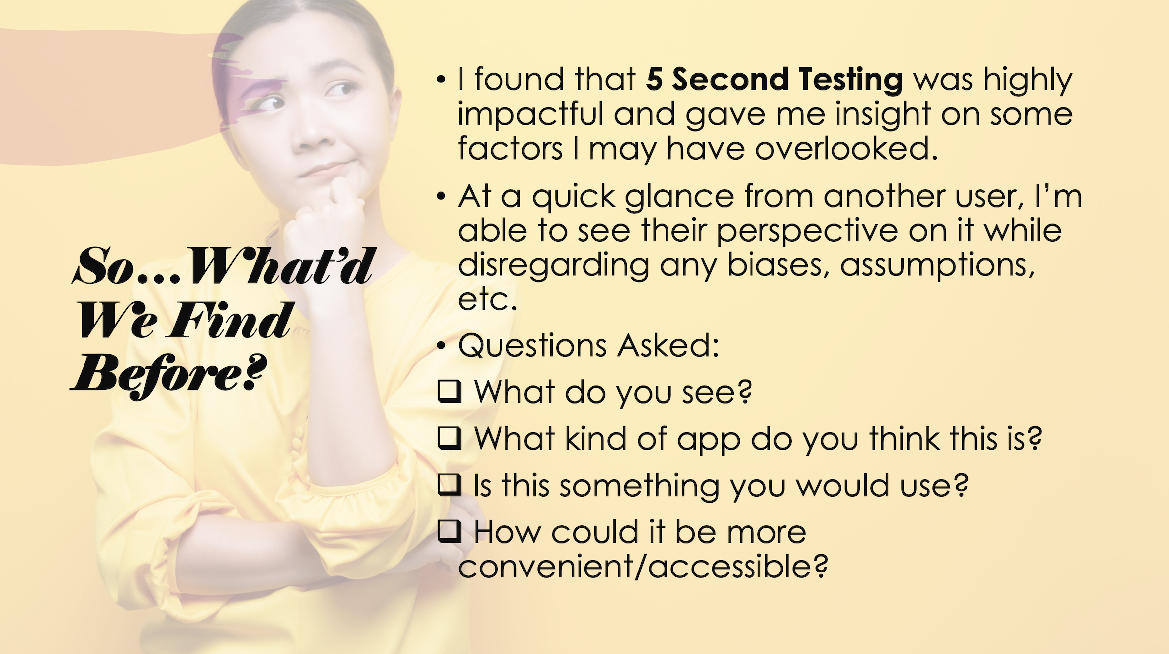


Based on the Usability Tests conducted, and scenarios completed, the following goes in depth at the executive summary outlined earlier in the report.
1. How easily do users find our “Give Away’s 2 Go!” app service after using it as a real coded application?
2. How well do users understand the symbols and icons on a new platform?
User 1: ”Ah, yes. I saw this on the Prototype. Very familiar and easily recognizable even from afar”
User 2: “I like how the layout from the Prototype stayed the same in this case. Similar buttons and colour contrast.”
3. What changes would you like to be made to our coded application?
User 1: ”I think the shape for the profile of users could have remained the same - for both mobile and desktop. All ellipses would do.”
User 2: “I think the international service would have been a cool idea. Would’ve liked to see that more.”
4. Can users easily differentiate and detect the differences between the low-fidelity mock-up of
’Give Away’s 2 Go’ and the real deal? (coded application).
User 1: ”Seems almost the same. Nothing tricky. Let’s see what the other page is about.”
User 2: “Let me go here, I wanna read this. I’ll come back to this page after.”


"During this in-class activity, I was paired up with 3 peers and in rotation, we had 1 minuet to explain our project proposal to them as detailed as we can. Then afterwards, they are responsible for writing down as much information they obtained onto the sheet of paper."

This user flow undergoes the pathway a user will go through coming across my donation exchanging service.
It highlights what the user will come face-to-face with, may stumble upon, along with giving them the option to agree or decline on a function, and where it will take them next.


"Overall, my Usability Testing, Studies, and Research tests conducted tells me that I’m designing for a large audience, and I must take into account the different personas and characteristics each user has when coming across my application. One of my Eureka moments was when I was performing my ‘Wizard of Od’ testing method and observing how my user interacts with the new features being added. Along with initial reactions (facial expressions, happy paths, potential pain points, etc)."
